Collect Southern Africa
1949 - 54 Screened Definitives

1954 Intense Deep Blue was SG 117b (SACC 116b)

 
In February 1940 the 3d value was printed from an unscreened Exterior and a screened Interior cylinder and is listed as SG 59.
In late 1947 the ½d Springbok was printed from a screened frame and unscreened vignette and listed as SG 114.

The Rotogravure Definitives printed from all Screened cylinders first appeared in February 1949, starting with the ½d, followed by the 3d in April, 2/6 in August and 5/- in September. During 1950 the 1d, 2d, 6d and 1/- followed and finally the 4d in August 1952. The long lived designs of the Union definitives were supplemented with three new Pictorial values of 4½d, 1/3 and 1/6 on 1 October 1953 and finally all the values were replaced with the Animal Definitives in October 1954.


In order to build up a profile for this Era, to start with, two articles are reproduced in this section
How Deep is my ‘Blue’ -The Final Reprint of the 3d Groote Schuur Definitive SG 117a/b

By Otto Peetoom

Figure 1 - SG 45

Figure 2 - SG 59

Introduction

When it comes to the possibility of a range of shades for any particular stamp it sparks a debate of differing opinions that may continue for decades. Union Philately offers a variety of desirable shades such as the King’s head ½d Mossy green and whilst it remains a very under-rated stamp, this shade does vary in its intensity.

The January 1950 reprint of the commemorative 1d Ox wagon SG 131 has an interesting claret shade that is not listed in any of the popular stamp catalogues such as Stanley Gibbons, the S.A.C.C. or the KGVI Commonwealth editions. It is worth looking for and is certainly not as common as the total printing figure of 21 million plus might suggest. A more recent desirable shade is a RSA no watermark 10 cent emerald green definitive SG 217a.

All the foregoing examples tend to be straight forward but the object of my article is a shade that is misunderstood, confusing and provides an ongoing headache for even the most experienced Philatelists – The 1954 last reprint of the mono-coloured screened 3d Groote Schuur definitive, I have enjoyed a fascination with this shade for more than a quarter of a century.

During 2006 I wrote an unpublished article on the subject and by co-incidence Bas Payne published an article in the April/June 2006 edition of The Springbok entitled Short stamps, large, small, and drunken perforations – a contribution to the printing history of the 3d pictorial Groote Schuur Issue 5 (SG 117a) Since then I have had further discussion with Bas and others on the subject and I believe that I now fully understand the saga of the deep blue shade.

The History of the 3d Groote Schuur Definitive

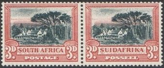
The black and red unhyphenated versions: The 1927 issue was printed from two plates by Bradbury, Wilkinson in London using the recess method.

The 1931-32 Pretoria printings were produced by the Government printer using two rotogravure unscreened cylinders, again in black and red but with a slightly different frame feature and listed as SG 45 - Figure 1.

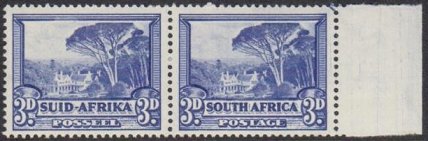
The 1933-37 final unhyphenated reprints continued the use of interior and exterior unscreened cylinders, printed in blue and blue, thus creating the impression that they are mono-coloured stamps.

The 1940-49 hyphenated issues again printed with two cylinders in blue and blue but with a new variation. The February 1940 stamps had a screened interior and an unscreened exterior, they are listed as SG 59 - Figure 2.

The April 1949 printing is an all screened issue listed as SG 117. Illustrations in the Union Handbook allow us to appreciate the relative differences. For this printing the cylinder numbers appear on the sheet margins. The interior on the left margin as Cylinder No 44A and the exterior on the right margin marked Cylinder No 44B. (Carry on below)

 
I have traced only one contemporary report on this printing, in the September 1954 S.A. Philatelist on page 157 under Union Notes it reads:-
Current 3d Pictorial Stamp in Deep Blue shade: Mr J.B. Levy of Bloemfontein records that the current 3d postage stamp printed from cylinder No.17 is at present appearing in a very deep blue colour which he considers is worthy of catalogue rank. They were first noticed on sale towards the end of July and undoubtedly much darker and have a comparatively brighter general appearance than the 3d stamps previously available.
This S.A.P report is the only comment on a mid-1954 reprint.
The details of the delivery of 34,330 sheets for Job 17412 appeared in the October 1954 S.A.P. None of the 1955-1986 Union handbooks mention this printing.

The 1960 UHB merely added a deep blue shade to the basic stamp and the 1979 - 86 editions modified the description to deep dark blue. On page 96 in the 1986 UHB it states...one small printing had the stamps in deep dark blue colour which is quite striking, but as there were other printings in a fairly dark blue, collectors should compare theirs with copies which are known to have the correct colour before classifying them. The foregoing is rather vague as it merely hints at one small printing ..... in a deep dark blue colour’ and ‘other printings in a fairly dark blue.
It clarifies nothing and simply adds to the confusion, thus the UHB intimates that there were only two printings using cylinder 17 when in fact there were four.

The Shade
In the S.A.C.C. it is described as No 116b blackish blue (Large perf. holes). The Murray Payne KGVI catalogue lists it as No 31b deep intense blue and I recall several discussions with the Editors that resulted in the following footnote
31b an extremely deep dark shade with large perforation holes. We previously considered the size of perforation holes to be a reliable test for the shade, but this is not the case. We now recommend an expert committee certificate be obtained when purchasing this stamp.


For many years Stanley Gibbons Commonwealth catalogue included a SG l17b Deep blue but for some inexplicable reason they deleted it in 2004.

Two different deep blue shades exist on the last printing and they vary in their intensity and what exactly qualifies as the deep shade is a matter that has been debated for some time.

An intense deep blue shade
One version is considered correct and the other I have dubbed The Pretender. To confuse the matter even more I have had sight of a block of twelve and its shade falls in between the other two. So where do we go from here?
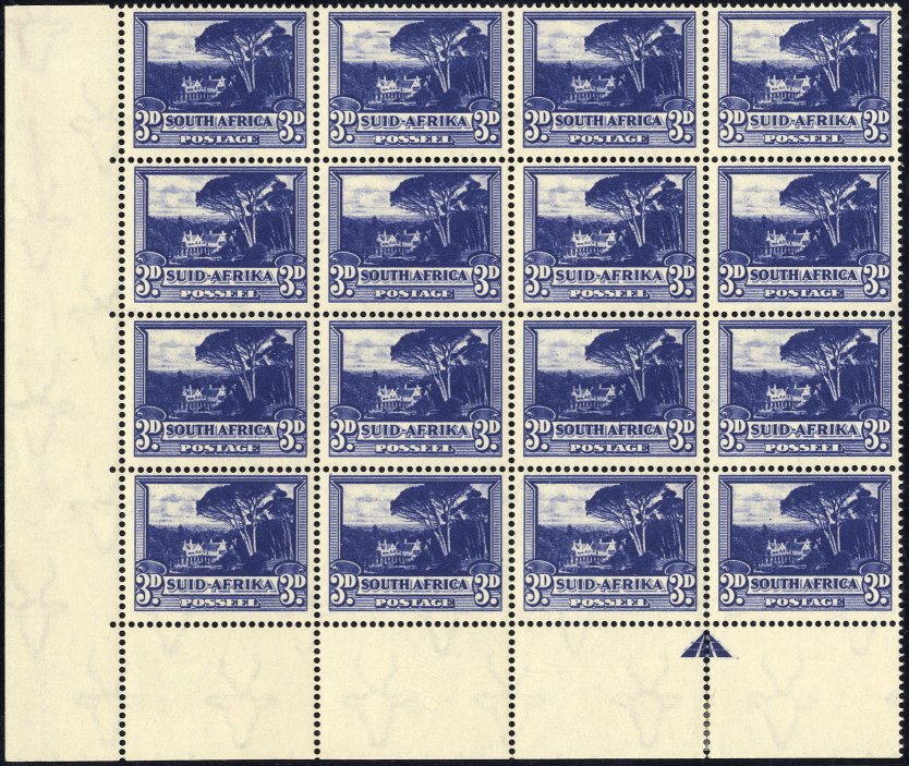
A dealer friend informed me that he had handled a full sheet of the 1954 reprint and recalled that the stamps along the bottom rows had much deeper shades than those on the top rows. He said that he had submitted pairs from the top half of the sheet which did not get a clear certificate whereas those from the lower half were classified as the deep blue shade.

(Carry on below)


Figure 3 - Cylinder 17
Large Perforation holes
Figure 4 - Cylinder 17
Small Perforation holes

Figure 5 - Intense Deep blue
Cylinder block with PFSA certificate
The 1951-54 Mono-colour printings from a single cylinder

A new cross lined screened cylinder that combined the vignette with the frame was used for the final printings of the 3d Groote Schuur. It was numbered cylinder 17 and the distinctive shaped clouds in the sky make it easy to identify these particular printings.
In the right margin on row twenty a figure 17 is printed in blue. The language setting was changed so that the first stamp on each sheet was in English instead of Afrikaans as previous.

The listing of cylinder 17 in the Union handbooks varied; in 1952 it was GROUP 5 - PLATE VII.
The 1960 and 1979 editions called it ISSUE 7 and the 1986 UHB changed that to ISSUE 5 and in the SG catalogue it features as SG 117a.

March 1951

First printing Sheets with four figure red serial numbers.

March 1952

Second printing Sheets with five figure black serial numbers reported in the May 1952 S.A.P on page 82. An interesting variety noted and illustrated in the April 1952 S.A.P. is a right marginal block of six with a black sheet No 29122 with the figures partially on the adjoining stamps. Both these printings had normal size perforation holes.

In the Bas Payne article he gleaned from S.A.P. issues from 1951 to 1954 that printings from Cylinder 17 were part of four Government print jobs with delivery of 390,542 sheets. The first two jobs produced normal sized perforation holes and the later deliveries of the third job No 12743 plus the fourth job No 17412 all included sheets with larger perforation holes. From a used copy, Payne notes that he first observed the large hole perforation for 30 October 1953.

One myth that must be laid to rest is that it does not follow that a 3d with large perforation holes equates to a deep intense blue shade - See Figure 3.

My observations on the Small & Large Perforations
On the 1951-54 printings

Using an electronic gadget called a PERFOTRONIC manufactured by SAFE, I have measured numerous pairs of both the normal and large perforation issues. The small perforation hole printings measure perf. 14 consistently whereas some of the large perforation hole stamps can measure either 13¾ or 14¼ instead of the normal 14.
When matching the horizontal perforations of a small perforation hole pair to one with large holes. If one lines up the centre perforation between the stamps with each other the small and large holes at the extreme ends do not line up even though both pairs may measure perforation 14.

The June 1954 Printing with Larger Perforation Holes
From my own research and observations it appears that either part of or all the sheets were printed in a much deeper blue than the previous three Government jobs, but it isn’t quite that simple as there are variations that require clarification. Shading the fourth printing One distinctive feature is that every Afrikaans stamp is lighter in colour in the South-west corner in an area above and around the left value tablet. Whenever one compares shades on the stamps from the last printing, the respective languages should be matched up i.e. compare an English stamp with another English stamp. (Go to top of right column)

  This intimates that two different deep shades are possible from the same sheet, in which case The Pretender ought to qualify for a clean certificate, but it doesn’t!

The foregoing anomaly is nothing new and the same situation occurs on Great Britain KGV definitive shades and suggests that the printing plates may be slightly warped producing deeper shades on portions of a sheet of stamps.

I possess a photocopy of PFSA certificate No 8894 dated 16 January 1988 showing a block of 66 - the lower eleven rows of sheet No 5866 that suggests that the stamps on the bottom right are much deeper in shade compared to those on the top left.

The story doesn’t quite end here, whilst the two shades from the same sheet is logical, it does appear that the very deep shade in a used condition is almost none existent.

To sum up the difference between the two deep shades

The Pretender: I have pairs with much deeper blue shades that most individuals would happily accept as the correct shade, yet their colour is considered not quite deep enough. I have examined over fifty used singles, all used during August 1954. They are all Pretenders and their usages include Braamfontein, Johannesburg, Mayfair, Parkend, Pretoria, Roodeport, East London & Uvongo Beach. I also have a used vertical pair used in Johannesburg and dated 13 SEP 54 only a month before the issued Animal series - See Figures 6 & 7
An important characteristic of the Pretender is that the detail of the bushes in the foreground is still defined. Three pairs I submitted received certifi¬cates stating they are not the 1954 deep blue shade. I disagree with such a statement, given that they are from the same June 1954 printing and they do have a deep blue shade, it just so happens that a more intense deep shade exist.


The intense blue shade - the ink is now that deep and intense blue that the bushes are virtually a solid mass of colour with much of the detail gone except in the area on the SW corner on Afrikaans stamps which is lighter than the corresponding area on an English stamp. Such a shade will certainly obtain a favourable certificate. The multiple with an in between shade that I mentioned earlier may prove a potential headache for an expert committee, however in my opinion it ought to be classified as an intense blue.
I have never encountered any used examples of this shade except one block of four cancelled at Houtbaai, see Figure 8.

The deleted SG 117b One wonders why Stanley Gibbons axed the 3d deep blue; do they consider it a too complicated shade? Surely not, there are far more confusing shades in the SG catalogue. Take for instance Falkland Islands the 1891-1902 definitives that include six shades each on the ½d and 2½d and a total of nine on the 1d value. How many people are able to distinguish between minefields of shades like that?

The June 1954 3d printing with either a deep blue The Pretender or Intense deep blue shade both exists and in my opinion each shade is difficult to obtain. The fact that they are considered as part of the KGVI period provides a much larger audience for their demand. The down side is that the vast majority of Philatelists are unable to distinguish which is which and I wonder how many Expert Committees experience a similar dilemma.


Figure 6 - Pretenders used at
Johannesburg -Pair with PFSA
Certificate
Figure 7
Singles used at
Pretoria & East London
Figure 8 - Intense Deep blue used at
HOUTBAAI 2 XI 54
With 1988 PFSA certificate No 8937

The opinion of an expert committee on a 3d intense blue is very much dependent on the type of reference material available to them, because without one, they have a problem!
I have two Pretenders with certificates that state ‘...is genuine, but not the deep blue shade as submitted’

Without doubt, the Pretender has a deep blue shade but alas not Intense deep blue, yet it cannot be classified as SG 117a as it originates from the same printing and/or sheet as the Intense deep blue.

My acknowledgement goes to a whole host of individuals who are too numerous to accurately recall and thank.

The Small format 2d Union Building Definitive SG 134

By Otto Peetoom


Introduced during April 1950 and intended to supersede the 1½d small format gold mining when the inland postage rate was increased to 2d on 15 May 1950. Information on this new reduced sized 2d appeared in the May 1950 S.A.P.
Its sheet format is twelve rows of twenty stamps and the first requisition was Job 12995 being an order for one million sheets x 240 and the first delivery of 24,000 sheets on 18 April 1950.
Printed from new cylinders 6927/50 and by 14 June the total delivery was 191,250 sheets.
The SAP report concludes: They will probably be on sale at a number of post offices in the Union before the end of April.
A review of this new issue appears in the June 1950 S.A.P. followed by some noted Printing flaws in the July edition.

Job 12995 for one million sheets x 240 - Cylinders 6927 & 50
Delivered by
No of sheets
Total delivered
S.A.P. References
18.4.1950
24,000
24,000
August 1950
14.6.1950
167,250
191,250
August 1950
26.9.1950
242,090
433,340
November 1950
4.1.1951
330,250
763,590
March 1951
4.4.1951
138,250
901,840
June 1951
10.7.1951
135,000
1,036,840
September 1951
Job 475 for one million sheets x 240 - Cylinders 6927 & 50
First delivery 14.6.1951
A
Delivered by
No of sheets
Total delivered
S.A.P. References
   
10.7.1951
*117,750
*117,750
September 1951
B
11.10.1951
360,737
478,487
December 1951
11.1.1952
89,650
568,137
March 1952
29.7.1952
239,798
807,935
September 1952
21.10.52
99,700
907,635
January 1953
 
Job 475 (Continued) - New Cylinders 30 & 18
23.10.1952
13,500
January 1953
C
29.10.1952
18,000
31,500
January 1953
27.11.1952
203,000
234,500
March 1953
 
Job 475 (Continued) - New Cylinders 27 & 46
Delivered from 2.12.1952 to 4.12.1952
4.12.1952
6,000
6,000
March 1953
D
 
Job 475 (Continued) - New Cylinders 27 & 18
Delivered from 4.12.1952

20.1.1953
122,000
122,000
March 1953
5.3.1953
134,600
256,600
July 1953
Job 475 combination of cylinders = 1,404,735 sheets
Job 5906 for one million sheets x 240 - Cylinders 27 & 18
First delivery 30.6.1953
Delivered by
No of sheets
Total delivered
S.A.P. References
21.7.1953
16,246
16,246
September 1953
21.10.1953
158,610
174,856
January 1954
21.1.1954
201,750
376,606
June 1954
21.7.1954
520,856
722,606
October 1954
10.8.1954
92,068
**814,674
February 1955
*Job 475 the Recent Printings report in the September 1951 the number of 2d sheets printed is given as 171,750 and appears to include transposed figures of 1 & 7 or is a typing error. By adding that number to the next figure it introduces a huge discrepancy but by using 117,750 the figures balance.

** Job 5906 being an order for one million sheets was not completed due to the issue of the Animal series on 14 October 1954; the final date of delivery of the small format 2d is 10 August 1954 (May 1955 S.A.P.)

Further notes on this issue appeared in The South African Philatelist in December 1952, during 1953 in March, April, May, June (Report of misplaced vertical perforations) - My search extended to 1969.

Cylinder changes on the small format 2d - Issues as per 1986 Union Handbook
Issue 14 April 1950
Cylinders 6927/50
1,944,475 sheets
Issue 15 November 1952
Cylinders 30/18
234,500 sheets
Issue 16 December 1952
Cylinders 27/46
6,000 sheets
Issue 17 December 1952
Cylinders 27/18
814,674 sheets
On issue 14 the first stamp on the sheet is English on the others it is Afrikaans. The printing figures indicate that the first cylinder is the most common, whereas the third cylinder in comparison is relatively scarce.
Cylinder blocks of Issues 14 - 17 are relatively easy to obtain and allows the philatelist the oppertunity to appreciate the different shades between the printings, this is very useful when studying these stamps overprinted OFFICIAL.

Web design by Otto Peetoom