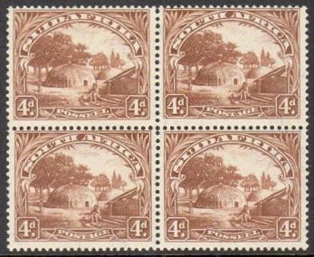
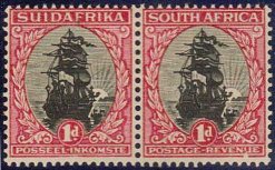
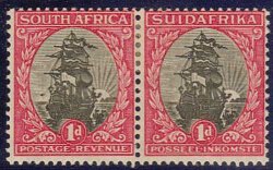
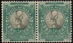
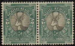
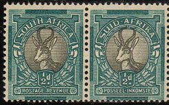
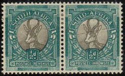
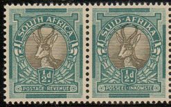
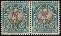
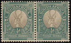
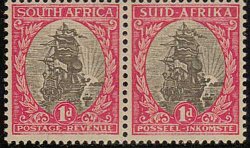
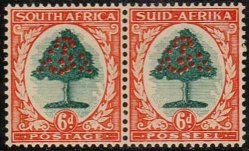
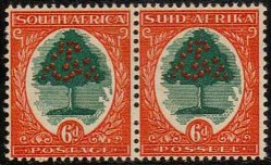
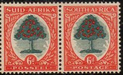
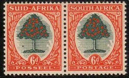
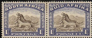
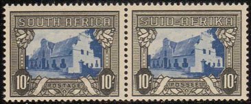
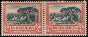
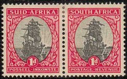
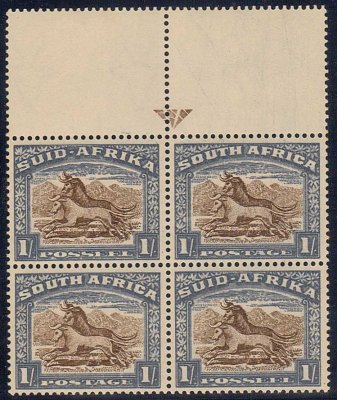
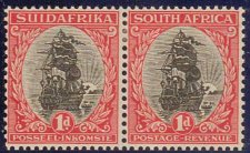
1926
- 27 Typographed ½d, 1d and
6d - SG 30 - 32 or SACC 29 - 31
|
The
½d and 1d were issued on 1 January
1926 followed by the 6d
value on 1st May
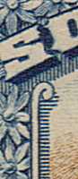
_There is no hyphen between SUID
and AFRIKA
The issue was
initially printed by Waterlow
& Sons in London and
from 1927 by the Government Printing
Works in Pretoria - The
stamps are perforated 14½ x 14
except in the 1927 Pretoria 2s 6d booklet
(SB6) which is perforation
13½ x 14 and the ½d
and 1d
stamps are listed as SG 30e and 31d |
| |
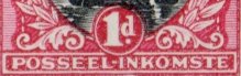
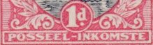
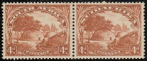
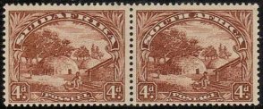
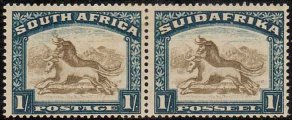
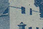
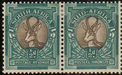
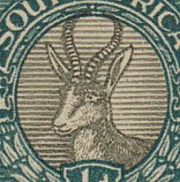
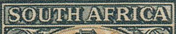
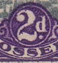
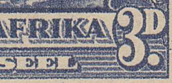
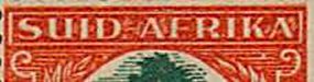
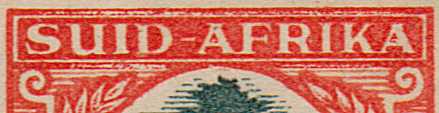
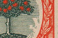
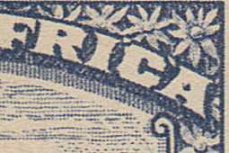
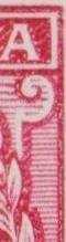
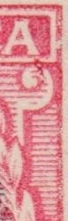
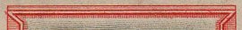
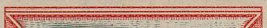
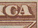
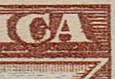
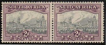
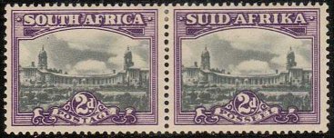
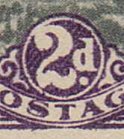
This
Issue can be differentiated from
the later Rotogravure Printings
by the curved shape of the
Leg of the R
in
AFRICA or AFRIKA
- See illustration
at left
The illustration
at right depicts the shape of the
R on
a Rotogravure
Printing
|
|
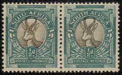
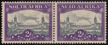
| The
Pretoria printings can be differentiated
by their poorer quality & duller
colours
- For
instance
the black is usually
a shade of grey
Any used copy
dated during 1926 has to be a London
Printing
|
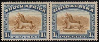
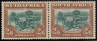
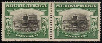
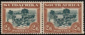
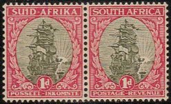
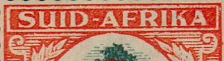
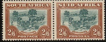
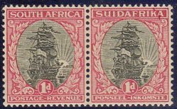
1927-
30 London Pictorials
The Recess printed 2d, 3d, 4d, 1/-,
2/6, 5/- & 10/- SG 34 - 9 or
SACC 33 - 39
|
| .jpg)
|
Printed
by Bradbury & Wilkinson
in London Six values were
issued on 1 March 1927
followed with a 4d
value on 23 March 1928
Again
there
is no hyphen between SUID
and AFRIKA
- Initially Perforation 14 |
|
|
With
experience these are easily identifiable
at a glance. Printed by Bradbury &
Wilkinson in London these are high
quality engraved stamps with finely
etched lines and a clean appearance
free of the dots & blobs of the
Rotogravure issues |
|
|
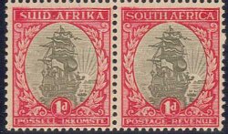
Initially
Perforation 14
- Later they were perforated 14
x 13½ with the perforator
moving either upwards
or downwards
The foregoing perforations are not
exactly accurate and stamps are
often offered Mis-described
Rather
than using a perforation gauge there
is a simple method that is thought
to be infallible
It involves looking
for a half perforation
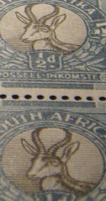
|
| Perforation
14 |
Perforation
14
x 13½ down |
Perforation
14
x 13½ up |
| If
there is no half perforation
It is perforation 14 |
A
half perforaton at the bottom
It is perforation 14 x 13½
down |
A
half perforaton at the top
It is perforation 14 x 13½
up |
|
Now go back
to the set above and it will become
obvious that all the pairs are perforation
14
The Stanley
Gibbons Commonwealth catalogue does
not differenciate whether it is perforation
up or down
|
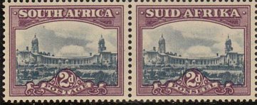
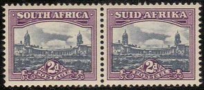
| 2d
- SG 34, 34aw & 34b (SACC 33) |
Identification
is easy as the Delville Wood War
Memorial, having not
been
built, does not appear in the design
over the top left of the value tablet
-
It exists in all three perforation
types 14,
14 x 13½ down
and 14 x 13½ up
and is an interesting stamp - The
perforation 14 is also known with
its
watermark
inverted and
is rare
|
| Anyone
wishing to study this value ought
to refer to a P.F.S.A. booklet entitled
- The Union 2d. London Printing, The
Final Chapter by Hagger
& Tonking |
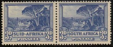
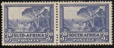
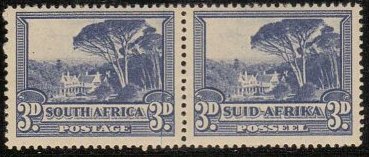
| 3d
- SG 35 & 35a (SACC 34) |
| It
has finer lines and a cleaner appearance
than the rotogravure equivalent and
does not have a thick white bar in
the top frame it exists perforation
14 and
14 x 13½ down
|
| Perforation
14 |
Perforation
14 |
Perforation
14
|
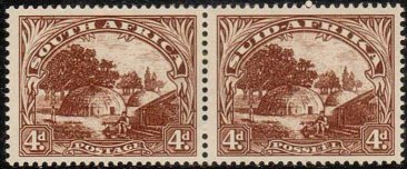
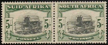
| 4d
- SG 35b, 35bw & 35c (SACC 35) |
This
is a little more difficult but has
several minor
differences from later issues
The finer engraving shows particularly
in the scrolls under POSTAGE
or POSSEEL
It exists in all three perforation
types
14, 14 x 13½ down
and 14 x 13½ up
|
|
The perforation
14 x
13½ up
is
also known with its
watermark inverted
and is rare
4d - SG 35bw (SACC 35f)
Watermark
Inverted
Perforation 14 x
13½ up
Peetoom
Collection
|
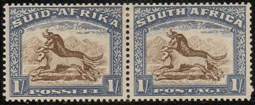
| 1/-
SG 36 & 36a (SACC 36) |
| There
is shading to the right of the scroll
under the S
of SOUTH or
SUID
It
exists in all three perforation types
14,
14 x 13½ down
and 14 x 13½ up
|
| Perforation
14 |
Perforation
14
|
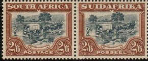
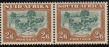
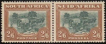
| 2/6
SG 37 & 37a (SACC 37) |
| This
is a little more problematic though
the shading under the country name
is fine and regular It
exists perforation 14 and 14 x 13½
down
Locating a fine used example of this
value is a big ask - Peetoom
comment
|
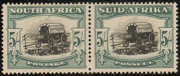
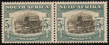
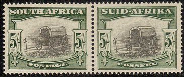
| 5/-
SG 38 & 38a (SACC 38) |
|
The
leg of the R of AFRICA
or AFRIKA is shaped
in a similar fashion to the low values
and quite different to the straight
edged shape found on the Rotogravure
issues. The general appearance is
much finer than the rotogravure printings
- It is at times confused with the
last 1954 5/- SG 122a as it is superficially
similar although the latter is yellower
in colour. The obvious difference
is a hyphen between SUID and AFRIKA
and is of course screened rotogravure,
whereas the Bradbury 5/- is recess
printed - It
exists in all three perforation types
14,
14 x 13½ up
and 14 x 13½ down - the latter
being the scarcest |
| Locating
a fine used example of this value
is another a big ask and a well centred
copy difficult - Peetoom
comment
|
| Perforation
14 |
Perforation
14
|
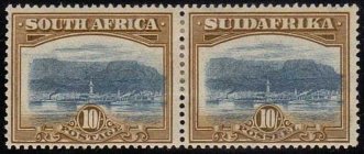
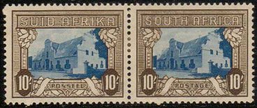
| 10/-
SG 39, 39a & 39b (SACC 39) |
As
it is the only Pictorial definitive
depicting Table Mountain it cannot
be confused with any other definitive
- The frame design came from the same
master dies as the 2d and the only
differences are in the value circle
- It
exists perforation 14 and 14 x 13½
down _Although there
was only one issue of the 10/-,
it is known with an Aniline
blue
centre listed as SACC 39c
The Inverted centre is SG 39a and
an article on the variety appeared
in The Springbok
and later in The South
African Philatelist
|
1930
- 45 Unhyphenated Rotos
|
|
|
SG
42 - 49 or SACC 42 - 50 Introduction
|
|
| |
The
lack of a hyphen between SUID
and AFRIKA
differentiates these issues from all
later ones
The rotogravure
process produced less high quality
stamps. South Africa was one of the
earliest countries to use rotary photogravure
i.e. Producing continuous sheets by
printing from cylinders
- It was done for economic reasons
but there was a lot more that could
go wrong
Cylinders got scratched or damaged
and dots and blobs became commonplace,
not to mention a range of other types
of flaw which makes this such an interesting
group to study
|
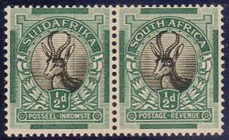
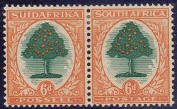
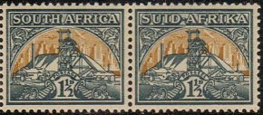
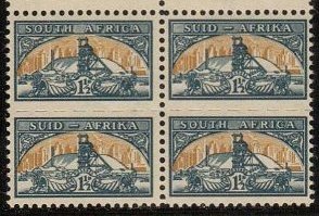
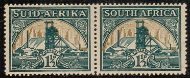
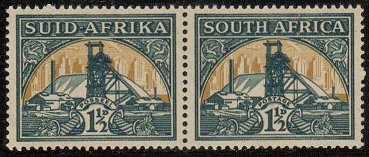
| 1930
½d Springbok - SG 42 or SACC
42 |
|
|
The
½d, 1d and 6d are all easy to
differentiate from their typo predecessors
by looking at the leg of the
R of Africa or Afrika
where it is straight edged rather than
shaped. Distinguished
as above and produced from three combinations
of cylinders it exists in various marked
shades with the watermark either upright
or inverted |
|
| 1930
1d Ship Type I -
SG 43 or SACC
43 |
| |
Also
essentially distinguished by the shape
of the leg of R
- The first six issues of this
stamp are in jet black & shades
of rose carmine, carmine or maroon
The watermark is nearly always upright
- except for a few later
They can also be found with no watermark
or watermark Trefoil
These are from the Rotogravure
Trials at Darmstadt
Two examples from these trials have
the usual watermark
Springbok's head but can be differentiated
by the different shades, especially
one which has distinctly pinkish frames
In June
1931 new cylinders were used producing
stamps usually in a lighter shade and
invariably with the watermark inverted
Type
I Narrow Spacing between lines
of Shading - Type
II Wider Spacing |
Type
I
|
Type
II
|
| From
1932 1d Ship Type II -SG 43d or SACC
43c |
| |
The
frames are now redrawn with the spacing
of the lines under the side spandrels
being more widely spaced - The gap
between POSSEEL
and INKOMSTE
has also increased - They are known
with watermark upright and inverted
The colours are different as well
- being black & rose with the
last printing having the so called
Steel
blue centres
|
| 1d
Type II |
POSSEEL
- INKOMSTE |
|
|
| 
|
|
Type
I |
|
|
Type
II |
| 1931
6d Orange Tree - SG 47 or SACC 48
|
| |
Again
differentiated from the typogravure
printings by the leg of the R
- It was produced in shades
of green & orange, red orange
or buff
The watermark is usually inverted
with only one printing having it upright
|
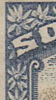
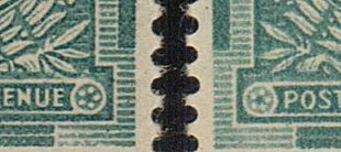
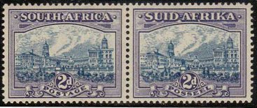
| The
2d Union Buildings - SG 44 or SACC
44 |
| This
is easily differentiated from the
Recess Printings by the presence of
the Delville
Wood War Memorial
- It was built in 1928 and
added
to the 2d design over the top left
of the value tablet - See
illustrations below
- It
was produced from three sets of cylinders
and has a very wide range of shades
|
| |
The
watermark exists upright or inverted
in all three issues - despite the
catalogue listings, the Upright
Watermark is
probably more common than the
Inverted.
The illustrations show typical
examples from all three issues. Note
the bluish centres from the third
issue which sometimes get confused
with SG 44e
With a
Trial printing,
Booklet and Roll (Coils)
stamps to add
to the above this is a superb stamp
to study in depth
|
Bluish
Vignette |
SG
44e Blue (Indigo) & violet |
| The
2d Union Buildings - SG 44 & 44e
or SACC 44 & 44a |
|
The
last printing from the Third Issue
in March 1938 had a significant colour
change to indigo and violet -Catalogues
list this as blue &
violet but the blue
is dark, often
Indigo.
The only confusable stamp is the hyphenated
issue and the hyphen is quite small
- The colour of the centres is, however,
always lighter in the latter |
| The
3d Groote Schuur - SG 45 or SACC 45 |
| 
|
Under
the Words
POSTAGE & POSSEEL and the
Bottom Frame
London printing
- two lines
Pretoria printing - one line |
London Printing
|
Pretoria Rotogravure |
|
Produced in November 1931 this can
be differentiated from the recess
printings by the solid white bar in
the top frame
It exists with the watermark upright
or inverted - Stamps with upright
watermark have a lighter shade of
red
|
| |
First
Printing
With Control A
Watermark Inverted
Note
the deep colours of the
Vignette & Frame
Second
Printing Watermark Upright
Vignette
much lighter
Frame lighter & brighter |
|
| The
3d Groote Schuur - SG 45c or SACC
45 |
| |
This
was produced in October 1933 in order
to conform to the UPU colour regulations
for stamps for overseas postage.
The colour was changed to blue and
blue. The centre and frame shades
can be quite different as in the example
shown.
The watermark exists either upright
or inverted.
In 1937 the vignette cylinder was
changed so that the cylinder varieties
of the earlier stamps disappeared
whilst the frame varieties remained.
- These stamps can usually be recognised
by the lighter shading of the sky.
|
| |
1933
Printing
Watermark Inverted - Common
Watermark up - Scarce
1937
Printing
Watermark
up - Common
Watermark Inverted - Scarce
|
|
The
1933 Printing is usually much
deeper in colour and the lines of
shading
above the trees are well etched |
|
The
1937 Printing is much lighter and
the lines of shading above the trees
are
faint & often appear to be omitted |
| The
4d Native Huts Type I - SG 46 or SACC
47 |
|
London
Recess |
|
Roto
Type I |
|
Roto
Type II |
| |
Issued
in Novovember1932 this can be differentiated
from its recess printed counterpart
by the scrolls under the
ends of Postage or Posseel. In the
recess printing there are thin lines
of shading in these whereas in the
rotogravure printing the shading is
solid.
|
|
|
The
majority of stamps have the watermark
inverted.
Stamps with upright watermark exist
but are scarce and usually in a duller
brown shade.
|
|
| SG
46 Type I |
|
SG
46c Type II |
| The
4d Native Huts Type II (redrawn) -
SG 46c or SACC 47a/b |
| |
Issued
in 1936 these are most easily distinguished
by a prominent extra white curl in
the same scrolls mentioned above.
They had a long life until the hyphenated
version appeared in 1952 and are consequently
found in a large range of shades from
red, orange or purple brown to chocolate.
Most stamps have the watermark upright
but at least one issue had it inverted
and these are usually in a characteristic
light chestnut shade.
|
| The
1/- Gnus - SG48 or SACC 49 |
| |
Issued
in September 1932 these are easily distinguished
from the recess printings by the lack
of shading right of the scroll under
the "S" of South or Suid and
by the solid nature of the shading around
the "CA" or "KA".
They first appeared in yellow-brown
& blue with the watermark inverted.
The colours then intensified & a
printing exists in this shade with watermark
upright in 1934 (see illustration which
also shows the good "twisted horn"
flaw).
In 1936 the centres changed to grey-brown
with the watermark inverted again and
the last printings had sepia-brown centres
with the watermark upright.
|
|
|
| |
|
|
In January 1938 new cylinders were
used and the shade is usually a
reddish brown & ultramarine with
the watermark upright.
The newly listed (by Gibbons) "dart
in gnu's back" comes from this
printing and is thus scarce.
|
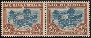
| The
2/6 Ox-Wagon - SG 49 & 49b or
SACC 50, 50a & 50d |
| |
Issued
at the end of 1932 these can easily
be differentiated from their recess
printed predecessors by the coarser
printing and solid shading between,
and under, the "CA" or "KA".
Shades before 1939 are clearly green
& brown though they vary a lot,and
it is from this era that the stamps
with inverted watermark exist - They
are scarce.
|
RECESS |
ROTO
|
| |
Slate
& brown |
Blue
& brown |
| |
Shades from the printings of 1945-8
have clearly blue centres and the later
show a lot of "plate" wear,
especially of the frames. The stamps
issued between 1939-45 are transitional
shades. They are wartime issues and
were small printings.
SACC states the slate & brown (illustrated)
to be the scarcest but there is a turquoise
green & deep chocolate shade that
is scarcer still. |
1933
- 51 The Hyphenated Pictorials |
|
Between
SG 54 to 135 or SACC 55 to 134 |
|
|
The
catalogues split these into unscreened
and screened sets with a few other
values scattered about the place.
This isn't entirely logical as some
stamps are part screened and currently
appear in either set.
The addition
of a glass screen was introduced from
1936 when it was used for the 1½d
gold mine frames.
In 1939 one was used for the 10/-
centre and from 1949 their use became
the norm except for the final printings
of the
10/- frames.
To see the effect
of a screen look at the 10/- centre
with a magnifier and this should show
the diamond patterned background.
Unfortunately
things aren't quite as simple as this
as screens varied and came in fine
or coarse crosshatch, or could be
irregular. Generally the effect was
to unify the colour and to give things
a slightly fuzzy look.
Lines that were etched in continuous
fashion tend to be broken up.
|
| ½d
Springbok - SG 54 or SACC 55 |
| |
|
Issued
in September 1935 this is a very easy
to identify. There is a large gap between
SUID and AFRIKA with the hyphen clearly
visible. There are 40 thin lines of
shading behind the buck's head. It is
perforated 15 x 14 with the watermark
upright or inverted.
It was also produced in roll form perforated
13½x14, again with upright or
inverted watermark. The roll stamps
were also issued in sheet form so horizontal
pairs exist. Indeed they are more common
thus than they are in vertical pairs,
or strips, from coil machines.
|
|
| ½d
Springbok - SG 75c & cd or SACC
55e, f & h |
| |
These were issued
from 1937-47 and cover a large number
of issues. The stamps were redrawn
with only 28 thicker lines of shading
behind the buck's head. They were
all perforated 15 x 14 with the watermark
universally upright. The size of the
stamp was 18.5x22.5mm until August
1947. The shades vary a lot. Earlier
ones tend to be in grey & green,
later in grey & blue-green. In
1946 some appeared with brownish centres.
In August 1947 the size was reduced
to 18.25x22.25mm. This issue is characterised
by a number of blobs or lines affecting
the vignettes as in the example shown.
|
| |
In
November 1947 there was there was
yet another reduction in size to 18x22mm.
With these issues the top and bottom
solid bars showed crosshatching (SACC
55h). They are similar to later issues
but aren't screened.
Accurately measuring stamps is difficult
but remember that the gutter between
the stamps will show double the difference.
If you're studying these issues it
may be worthwhile finding a used single
of each size, cutting all 4 corners
off diagonally, and using it as a
template.
|
| ½d
Springbok - SG 114 or SACC 113 |
| |
|
Issued late in 1947 the frames
are now screened |
|
| |
|
The
centres remain unscreened. The size
remains 22x18mm and the crosshatching
of the top and bottom bars remains but
the screen renders this less apparent.
Under magnification the solid lines
in the design of the frame appear interrupted.
|
|
| ½d
Springbok - SG 114c or SACC 113a |
| ½d
Springbok - SG 126 or SACC 125 |
| |
This
was a post war economy issue to use
up old stocks of paper used for the
typographed issues in 1948. The stamps
are the same as the previous typographed
½ds except that they are in
a very different pale grey & blue-green
shade
- Illustrated above.
|
| The
1d Ship, SG 56, or SACC 56 |
|
|
Issued
from 1934 these stamps are perforated
15x14 and sized 18.5x22.5mm. They
appear in various shades of grey&
carmine with the watermark upright
or inverted. As with the ½d
they were also issued perforated 13½x14
in sheets designed for roll stamps.
The comments here are the same as
for the ½d. |
|
| The
1d Ship. SG 56i or SACC 56b |
|
|
In
1940 the size of the stamps was reduced
to 18x22mm. Remember to look at the
gutters between the stamps and you'll
see they have increased by 1mm. The
watermark is always upright. The shades
vary a lot including the very dark
shade shown which is known as the
"sunset" issue - Illustrated
top right. |
|
| The
1d Ship, SG 115 or SACC 114 |
|
|
Issued
in 1950 the stamps are now entirely
screened. This can be seen clearly
by the lines in the sky appearing
dotted rather than continuous. The
frames have a fuzzy appearance. |
|
| 
SG 115
|
|
|
 SG 135
 |
| The
1d Ship, SG 135 or SACC 134 |
|
|
The
design was redrawn in 1951 and the
appearance of the stamps is clearly
different. The shading of the sea
is darker, the horizon clearly defined
and the sky much lighter. They are
wholly screened. The size of the stamps
has been reduced to 17.25x21.25mm.
|
|
| The
1½d Gold Mine, SG 57 &
57e or SACC 57 & 57a |
| 
Bright gold
centre
|
 Dull gold or
Yellow buff
Dull gold or
Yellow buff |
|
|
This is a new design
so there's no difficulty identifying
it. Issued in 1936 it is the first
of the pictorials to be partly screened.
Here it is the frames. The first
stamps have bright gold centres
and exist with the watermark upright
or inverted. Some of the first printing
have the shading on the mine dump
very faint or entirely missing.
From 1940 the centres changed colour
to dull gold or yellow buff and
the watermark is upright only
|
|
| The
1½d Gold Mine, medium format,
SG 87 or SACC 86 |
|
|
This
is a smaller version of the stamp
issued from 1941. Again there is no
difficulty in basic identification.
One of the early issues had a very
coarse screen used (known as the "waffle
plate"), SACC 86c. There are
several shades of the later issues.
|
|
| The
1½d Gold Mine, bantam format,
SG 124 or SACC 123 |
|
|
Again
no help is required with identification.
Issued in 1948 as part of the paper
saving programme they are perforated
14 & Rouletted 6½ between
vertical pairs.
|
|
| 2d
Union Buildings, SG 58 or SACC 58
|
| 
SG 58 Blue &
violet
|
SG 58a Grey
& purple
|
|
|
Issued
in November 1938 in blue & violet
they are similar to the last unhyphenated
issue. The space between SUID and
AFRIKA is quite small, as is the hyphen
so the 2 stamps sometimes get confused.
Looking for the hyphen and the lighter
colours should make things straightforward.
|
|
| 2d
Union Buildings, SG 58a or SACC 58a
|
|
|
In 1941 the colour
was changed to grey & purple.
They are produced from the same
cylinders as the previous issue
so are identical in all other respects.
Again confusion can occur between
these and the earlier unhyphenated
but the shade is unlike them and
the hyphen, albeit small, is there
|
|
| 2d
Union Buildings, SG 107 a & b
or SACC 106/a |
| 
Darkish shade
of slate & violet
|
Slate &
lilac
|
| 
|
There were many
different printings of these stamps
where the centre is, for the first
time, screened. They are quite easy
to identify as a group being quite
unlike any others.
The first issue is identified by
the "2" in the value tablet
touching the surrounding circle.
These are in a darkish shade of
slate & violet. The next issues
are in slate & lilac and the
"2" is now clear of the
circle. The later issues are the
same but appear in a slate and vivid
violet shade.
|
|
| 2d
Union Buildings, SG 116 or SACC 115
|
|
|
Issued in March
1950 the whole stamp is now screened.
The slate blue & plum shades
are characteristic of the issue,
especially the frame. The new feature
of the screened frame is quite apparent
under magnification where all the
lines appear fuzzy.
|
|
| 
SG 116
|
SG 134
|
| 2d
Union Buildings, SG 134 or SACC 133
|
|
|
The reduced size
of these stamps makes identification
easy. They appeared in a number
of shades.
|
|
| The
3d Groote Schuur, SG 59 or SACC 59
|
|
|
Issued in February
1940 this was printed from 2 cylinders.
The interior cylinder has a cross-hatch
screen easy to see in the sky. The
frame is unscreened. The centring
is often inexact either leaving
a pale line over the top of the
trees or doubling of the frame in
the same area if centred high. The
shades vary from blue to ultramarine.
The strength of the inscription
also varies.
|
|
| The
3d Groote Schuur, SG 117 or SACC 116
|
|
|
Issued in April
1949 it was again printed from 2
cylinders so the same comments regarding
the centring apply. The frames are
now screened and look quite different
(HG37). The lines of shading appear
more even and have a fuzzy appearance.
The shade is a dull ultramarine.
|
|
| The
3d Groote Schuur, SG 117a or SACC
116a |
| .jpg)
|
.jpg)
SACC 116b
Blackish Blue
|
|
|
Issued in March
1951 the whole stamp is again screened
but this time they were produced
from a single cylinder so that the
centring is always exact and the
comments above regarding poor centring
can't occur. The colour is deep
blue and this is probably the easiest
way of differentiating this stamp
from its predecessor. The shades
are often a very dark blue.
One printing in 1954 with large
perforation holes (SACC 116b) appeared
in a characteristic blackish blue.
Because of the difficulty of identifying
it for certain Gibbons no longer
list it separately. Other printings
also have the large perforation
holes so it should only be bought
with a certificate.
|
|
| The
4d Native Huts, SG118 or SACC 117
|
| 
|
Issued in August
1952 this is easy to identify as
it is the only 4d of this design
with a clear hyphen between SUID
& AFRIKA. It was produced from
a single screened cylinder and the
shading of the sky appears as a
series of dots.
|
|
| The
6d Orange Tree Type I, SG 61 or SACC
60 |
|
|
Issued in October
1937 this is easily differentiated
from its predecessors by the presence
of the hyphen between SUID &
AFRIKA .
This inscription measures 16.25mm
leaving a bit of a gap between the
"S" and 2nd "A"
and the side frames (HG41). The
easiest way of quickly identifying
this stamp is by noting the faint
background shading behind the tree.
|
|
| The
6d Orange Tree Type II, SG 61c or
SACC 60a |
|
|
Issued 8 months
later in June 1938 the frame has
been redrawn and "SUID-ARIKA"
measures 17mm so that the gaps between
the lettering and the side frames
is reduced (HG43). The background
shading behind the tree is noticeably
darker. Shades vary from green &
orange to vermilion or red-orange.
|
|
| The
6d Orange Tree Type III, SG 61d or
SACC 60b |
|
|
Issued in November
1946 the design has again been redrawn.
The size of the stamps has been
reduced from 18.5x22.5 to 18x22mm.
The most noticeable difference with
previous issues is that the scrolls
under the "S" & "A"
of the inscription are simplified
and closed. The shade is generally
green & reddish orange. (HG45)
|
|
| The
6d Orange Tree, SG 119 & 119a
or SACC 118 & 118a |
|
|
Issued in January
1950 the design remains the same
but the whole stamp is now screened
(HG47). This is most apparent in
the shading behind the tree where,
under magnification, the lines appear
as zigzags or a series of dots rather
than continuous lines. The catalogues
differentiate the shades into red-
or brown-orange. There are, in fact,
a number of shades but most fall
easily in to one category or the
other.
|
|
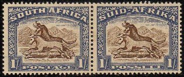
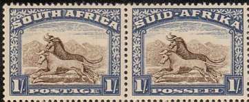
| The
1/- Gnus, SG 62 or SACC 61 |
| 
|
|
|
| 
|
Issued in February
1939 this is easily distinguished
from previous issues by the presence
of the hyphen between SUID &
AFRIKA. English singles can also
be identified by the restoration
of the shading to the right of the
scroll under the "S" of
South. The catalogues describe the
shade as brown & chalky blue
which is reasonably accurate for
the early issues which appear in
sepia brown and grey-blue, then
pale violet-blue. After the war,
however, there were several smallish
printings in much more strident
colours, including one in 1947 with
aniline centres.
The stamps were also issued in January
1948 from new cylinders characterised
by a mark in the hills in front
of the leading gnu's head. This
stamp also had the distinction of
being the only rotogravure issue
to have its marginal arrows printed
in the colour of the centres of
the stamps (Illustrated at left).
It is worth mentioning because,
although unscreened, its appearance
is quite similar to the later issues.
|
|
| The
1/- Gnus, SG 120 & 120a or SACC
119 & 119a |
|
|
Issued from 1950
these stamps are similar to the
final issue above but the stamps
are now completely screened. This
manifests itself most clearly in
the shading of the sky which appears
as a series of dots rather than
continuous lines. There are a number
of shades though they generally
fall into the brown & blue or
black & ultramarine shades of
the catalogues. Great care should
be exercised, however, if purchasing
the blackish shade with Official
overprint (SGO47a). There is a relatively
common deep sepia shade which looks
"blackish" when compared
to the browner shades and is quite
often confused for the scarce
SG O47a. The frames of the scarce
stamp are definitely ultramarine
rather than blue.
|
|
| The
2/6 Ox-wagon, SG 121 or SACC 120,
120a & 120b |
| 
|
Issued from 1949
these stamps are easily differentiated
from their predecessors by the presence
of the hyphen. They are also all
completely screened causing the
lines in the sky and frames to appear
as dots or zigzags. There were 3
issues of this stamp. They are all
clumped together by SG but separated
by SACC. The first was in green
& brown, the 2nd (1952) was
in a brighter green & cinnamon
brown and the 3rd (1954) had larger
perforation holes and a coarser
screen giving a streaky appearance
to the hills described as a "heatwave"
effect.
|
|
| The
5/- Ox-wagon, SG 64 & 64b or SACC
62 & 62a |
| 
|
|
|
|
Issued in October
1933 this is the first stamp to
appear with a hyphen between SUID
& AFRIKA. There is, in fact,
no unhyphenated rotogravure issue
of this stamp. The first issue was
in a grey-black & myrtle green
shade with the watermark upright
or inverted. In fact, in this shade
the watermark inverted is a little
more common than the upright. All
later issues have the watermark
upright. The catalogues divide the
stamps into frames which are either
"green" or "blue-green".
This is rather misleading. The first
shade is relatively scarce and there
is a typical blue-green frame which
was issued in 1945 which is more
common. There are, however, a number
of other shades which are also relatively
common but aren't blue-green. A
jet-black & intense green shade
appeared in 1940 and again towards
the end of the decade. A black &
grey-green shade was issued in 1947
and the stamp was "re-issued"
in 1950 (after the first screened
issue) in jet-black & blackish-green.
Which shade grouping you wish to
place these stamps in is up to you.
|
|
| The
5/- Ox-wagon, SG 122 & 122a or
SACC 121 & 121a |
|
|
Issued in 1949 and
1952 these are differentiated from
the previous 5/-s by the fact that
the whole stamp is screened. Again
this causes the lines of the sky,
and the frames, to be formed by
a series of dots. There is no difficulty
in distinguishing the 2 stamps of
this group as they're in completely
different colours. The first is
in grey-black & dull blue-green
whilst the second is in pale grey
and deep yellow green.
|
|
| The
10/- Groot Constantia, SG 64c &
ca or SACC 63, 63a & 63b |
|
|
There is no trouble
identifying the basic stamp as it
is the only one of this design.
The centres are from screened cylinders
whilst the frames are unscreened.
Issued from 1939 it had a long life
and it appears in many shades. The
centres vary from blue to "electric"
blue to violet blue or ultramarine.
The frames come in light or dark
sepia, sepia black, dull black or
deep charcoal.
|
|
|
|
I
hope you've found this guide useful.
If you have found any section difficult
please let us know and we'll try
and improve it.
|
|
|
|
|
|
.jpg)
.jpg)
.jpg)
.jpg)
.jpg)
.jpg)
.jpg)
.jpg)
.jpg)
.jpg)
.jpg)
.jpg)